I have been wanting to visualize the network of African American intellectuals and activists that I work on for a long time. This is for several reasons. One, it would be nice to have pretty maps in my future book. Two, I would like a computer to find patterns that I may have missed. Three, I would like a computer to keep track of everybody so that I don’t let important connections slip in my mind. Unfortunately, though, the heart of this is a detailed database. This is unfortunate because it is something I should have been keeping since the beginning of my research. It is a bit daunting to think about going back through the hundred or so people that populated my dissertation and create a rich database. The next problem is figuring out what columns to use in the database, particularly since one of the primary things I want it to do is track relationships. To me, relationships are not something you can describe in one, reusable word like “strong” or “weak.” For example, A small sub-theme of my work is the relationship between black intellectuals and their white graduate school mentors and classmates. Each relationship was marked by certain strains inherent in cross-racial interactions, but each relationship was also unique in the ways that it worked or did not work.
At any rate, something to share and a question to ask:
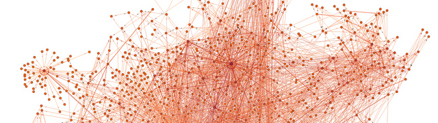
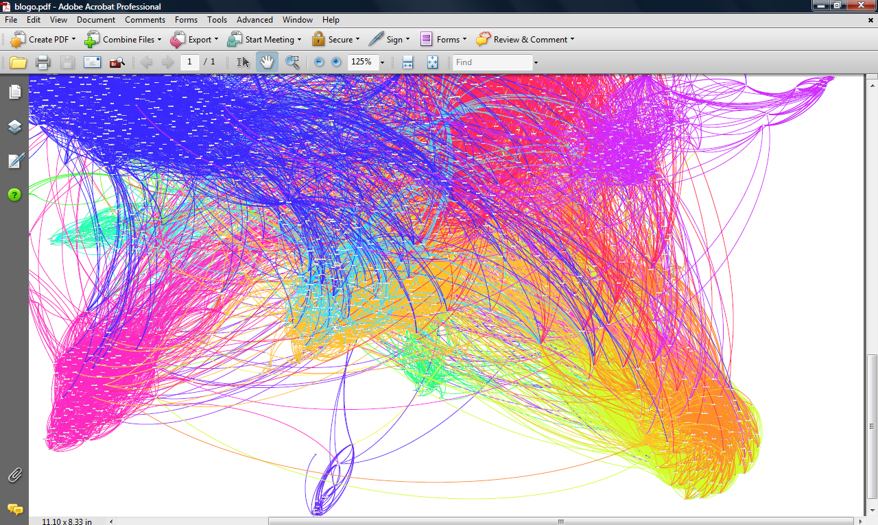
The most important thing I learned at THATCamp, for me, is that there is a software that does just what I want (well, I’m not sure if it can be overlayed on a map, but there is also other software that can place my network’s physical locations on a historical map). Gephi is “an interactive visualization and exploration platform for all kinds of networks and complex systems, dynamic and hierarchical graphs.”
The question–have you seen network visualization put to good intellectual use? Beyond pretty pictures? Did an author find something by quantifying their data that they would not have found by relying only on their brain to draw patterns?
(Images courtesy of Creative Applications Network).
One Thought on this Post
S-USIH Comment Policy
We ask that those who participate in the discussions generated in the Comments section do so with the same decorum as they would in any other academic setting or context. Since the USIH bloggers write under our real names, we would prefer that our commenters also identify themselves by their real name. As our primary goal is to stimulate and engage in fruitful and productive discussion, ad hominem attacks (personal or professional), unnecessary insults, and/or mean-spiritedness have no place in the USIH Blog’s Comments section. Therefore, we reserve the right to remove any comments that contain any of the above and/or are not intended to further the discussion of the topic of the post. We welcome suggestions for corrections to any of our posts. As the official blog of the Society of US Intellectual History, we hope to foster a diverse community of scholars and readers who engage with one another in discussions of US intellectual history, broadly understood.
Hi Lauren,
I was at the visualization session with you and enjoyed learning a bit about your project. Great stuff.
There are a few mapping oriented projects I’ve seen (DHers more expert than me will be able to point to even more). The most intriguing one for intellectual history, I think, is the Mapping the Republic of Letters. Nice video about the project here: http://www.michaeljkramer.net/issuesindigitalhistory/blog/?p=182. I would be curious what European intellectual historians think of this. My big question is this: does it reveal something new–Voltaire was in love with the idea of England, but had very few actual correspondents in England–or does it simply dramatize and visualize something we already knew. New or knew? In other words, is this an example of applying a digital tool to evidence in order to reveal new patterns or the equally worthy task of communicating what we already know in a more striking way?
Your comments do point to something that we need to incorporate right away into graduate training, which is the question of “data” management (I prefer the term “evidence” management, but I guess data will have to do in the digital epoch). From the start of a research project, historians-in-training will need to think critically and smartly about how they plan to store the evidence they are gathering (and the ideas they are generating) in digital form. It’s never too late to go back, but better to educate our students (and ourselves) early on in conceptualizing something like a database of our research. Zotero, Endnote, Excel, etc… The visualization software all rides upon the smart organization of the database.
As Jean Bauer (http://jeanbauer.com/) rightly points out, all databases involve normative claims as one tags and organizes the material. This question of normativity will be a topic worthy of continued study: what kinds of qualitative, interpretative information inevitably slips through the bars of the database cell? How do we continually tweak a database of evidence and interpretation in pursuit of historical argument at that register of knowledge? These are going to be fun and intriguing questions to explore in the coming years.
I really look forward to seeing your maps…but most of all the arguments you generate out of your material using your maps!
Michael